BOM PRESENTATION
A header and footer can be added to the Bill of Materials report and the content can also be configured in terms of colours, fonts and spacing by editing the relevant style(s).
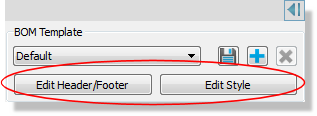
Changes will be reflected immediately on the screen and will propagate out to the presentation format (PDF Output) when generating the report.
Header and Footer
The header and footer can be added and customized from the same dialogue form.
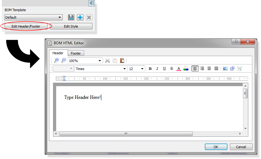
Editing the Header and/or Footer in the BOM Report. You can switch between header and footer via the tabs at the top of the dialogue form.
The dialogue form works quite a lot like your typical word processing application (e.g. MS Word), giving options for:
Magnification :
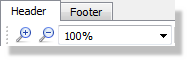
Adjust the magnification of the screen display. Does not affect the physical (printed) output but may make on-screen reading easier.
Clipboard:

Cut, copy and paste content from the clipboard. Icons are enabled when actionable. For example, highlighting some text would enable cut and copy and the paste icon is enabled only when content is on the clipboard and can be pasted.
Font:

Select the font style and size for the text. The font style applies to the paragraph unless you first select some text, in which case it applies to the selected text.
Decoration:
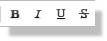
Select any desired decoration (e..g bold, italic) for the text. Applies to the paragraph unless you first select some text, in which case it applies only to the selected text.
Colour:

Enables the colouring of the font and/or the background. Applies to text about to be typed or a selection of text.
Justification:
Allows you to justify the header/footer text on the page. The default is left justified. See also the topic on the ruler, indentation and tab stops below.
Image Insert:

Allows you to insert an image (e.g. company logo) into the header or footer.
Ruler, Indentation and Tab Stops
While you can use justification (as described above) to position the header/footer on the page, you will have far more control if you use it in conjunction with the ruler. The ruler at the top of the header/footer dialogue allows you to independantly control the position of the first and subsequent lines of a paragraph as well as introducing spacing inside a line via tab stops.

The ruler at the top of the Header/Footer dialogue form.
The following descriptions are referenced by the red numbers added to the ruler image:
1) Paragraph Indent
The paragraph indent allows you to indent the current paragraph of text to the right. If you have more than one paragraph (unusual but possible) the current paragraph is the one with the cursor/caret.
2) Hanging Indent
The hanging indent allows you to indent the first line of the current paragraph of text to the right.
3) Tab Stop
A tab stop allows you to separate content on a line by a defined amount. See example below for more detail.
See also:
Example: Custom Header with Image.
Column Width Configuration
The BOM module will attempt to automatically define column widths to best fit the contents of the report on the page. If this does not suit, there are three things you can do manually that might help:
1) Change the page size or orientation. Often, switching to Landscape will make a big difference.
2) Change the font size of the relevant styles.
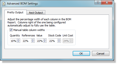
3) Set a percentage value for the columns via the Advanced Settings on the Generate Menu of the BOM Module. You should work left to right across the page when setting these values and it is of course best done at the end (when the schematic is finished and no more data will be added to the report).
Styling the Report
Styling of the report is largely user interface driven and requires little knowledge of either HTML or CSS.
The edit header and edit footer options provide almost identical functionality but at different ends of the report (top and bottom respectively).
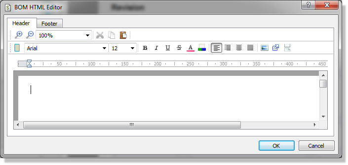
The basic procedure is:
- Click on the Edit Header or Footer Button
- Select font, colour and styling from the dialogue.
- Click in the editing area and type the header/footer text.
If you want to add a company logo you need to use the same procedure but click on the image icon instead.
See also:
Example: Custom Header with Image.
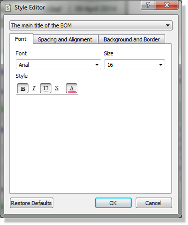
The body of the report is made up of a series of styles which contain font, spacing and colour information. These are all editable via the standard Edit Style dialogue form.
Style Selector
This combo box contains a list of all the styles used in the report and is ordered (approximately) from top to bottom. The report will update live to reflect any changes you make so if you are unsure what something is a quick change of font or colour will allow you to spot the affected area/text.
See also:
Font Tab
The font tab allows you to change the font face and font size of the currently selected style. It also allows you to specify font-decorations such as bold or italic and to change the font colour.
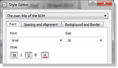
Note that if a table style is selected (e.g. Header Table) this tab will be disabled. The font can be changed by selecting the table content style (e.g. Header Table Titles or Header Table Values).
Spacing and Alignment Tab
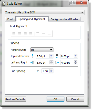
The spacing and alignment tab gives some basic control over the horizontal and vertical alignment of the text inside the cell. It also lets you control the margins between the cell and other cells. Adding top and bottom margins therefore increases the spacing between rows in the table.
Background and Border Tab
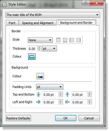
The background and border tab allows you to put a border around the text and/or to specify a background colour for the cell. It also lets you control padding which is the space between the text and the cell borders.
This is blue text (font tab) with a full box border and a light blue background colour. The bottom padding is the space between the bottom of this text and the edge of the blue border. The bottom margin is the space between the bottom border edge and the next paragraph of text.
When you specify a border you need to change the border style from none and also change the border width from zero before you will see any change on the screen.
The buttons to the right of the border allow you to specify what parts of the border are visible. This allows you for example to have specific underline (e.g. dashed and thick) or to vertically separate items with a border line.