ADVANCED PANEL DESIGN
How a Virtual Front Panel Works
While IoT Builder contains quite powerful editing tools and a set of themes for different control styles, you can if you want customize both the panel and the controls even further in a dedicated graphics package. The virtual controls on the front panel are implemented using SVG graphics elements controlled by Javascript classes. The root file (panel.htm) contains a javascript framework which pulls in panel.svg, panel.js and controls.js from the server. The entire of the front panel – even if it has multiple tabs – is held in a single SVG file – panel.svg. The SVG format used in panel.svg is augmented with additional data that is stored under the vfp namespace. However, for all this, the panel file is just a normal SVG file and can be edited using an external SVG editor.
Using Inkscape to Edit the Panel
Although it is possible to use any general purpose SVG editor to edit your panel file, we would strongly recommend that you use InkScape. It is free, and it is the tool we use internally to create the controls themselves so we know that it works well.
There are several reasons why you might want to edit the panel externally:
- To add complex graphics such as gradients which are not supported by the built in editor.
- To reposition the controls using more sophisticated snapping tools and guidelines.
- To make minor changes to the appearance of the controls.
Assuming that you have created a file association between InkScape and SVG files, then double clicking panel.svg under the resource section of the Project Tree will launch InkScape to edit it.
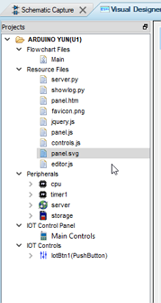
Double Click on the panel resource in Proteus to launch it in Inkscape.
However, before you do this, it’s important to understand that it possible to destroy your front panel if you do the wrong things with the external editor. The key thing to avoid is disturbing the group structure of the SVG file. Put simply, this means that in no circumstances must you ungroup the controls. If you do that, you will need to re-place them manually inside Proteus.
When you first open the panel.svg file in InkScape, you’ll see that each tab of the panel is held on a separate layer, these corresponding to top level groups in the SVG file structure. Note that you may need to use the visibility flags in the Layers Dialog to show the other tabs.
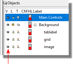
Then, on each layer the controls will generally appear as second level groups, at least unless you have used the grouping function in the build in editor. As long as you retain this basic structure, the panel will reload back into Proteus in full working order.
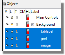
If you want to add extra graphics or text to the panel, you can just draw them using the InkScape tools. If you place them on the background layer, they will appear on all the tabs, otherwise they will appear on the tab corresponding to the layer that you place them on. Basically, if you draw graphics on the the Main Controls layer, it will appear on the main panel in Proteus. If you draw graphics on the Background layers, it will appear on all panels that are added to the Proteus project.
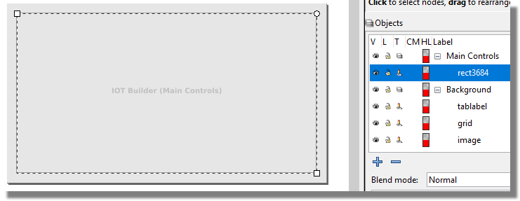
On the other hand, if you want to make changes to elements within a control you can do this by holding down ctrl whilst clicking on the element. This selects an individual element within the group structure without the need to ungroup it first. You can then change stroke/fill styles, font attributes and so on for that particular element.
As soon as you save the panel.svg file back from InkScape, Proteus will detect the change and reload it automatically.
Do NOT ungroup any of the IoT controls that are on the panel. If you do, the resulting SVG will not work in Proteus.
Control Editing
Unlike editing of the panel, the editing of controls is quite involved and requires an understanding of how the control is constructed. If you are interested in creating your own controls then please e-mail us at [email protected] and we can provide you with more detailed technical information.
Meanwhile, the following example shows how you can make a minor change to change the iconography on the icon buttons.
Creating a Custom Icon Button
We'll assume at this point that we are in the IoT Builder editor and have added an icon button to our panel. We've looked through the different icons and actually we want a happy face icon in the button. This isn't here but we do have custom icon option so we can make our own
Open your editor and then navigate to the Controls directory (inside \ProgramData\Labcenter Electronics\VSM Studio\ of your installation), select Pushbutton, then the theme you want and finally open the SVG file for the icon button.
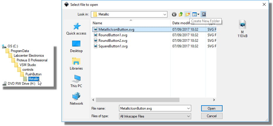
You need to open the icon button, not the standard button. It will have icon in it's name.
Open the objects panel to view the root structure of the SVG file. Expand the structure tree for a full view of groups and layers.
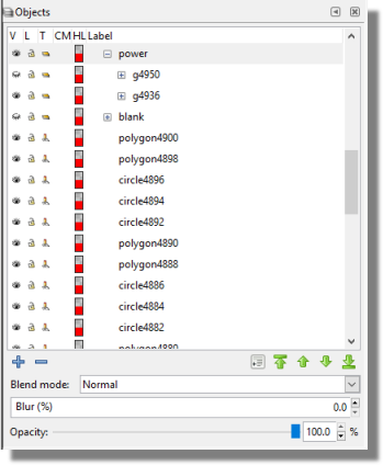
Do not ungroup any objects. If you do so the control will either not load in Proteus or not work properly if it does.
Hide any layers (i.e. Power) that are currently visible and unhide your Custom1 layer so that any graphics that you add will appear.
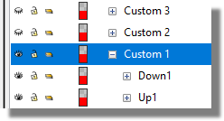
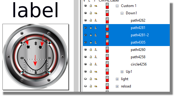
Locate the Custom layer (1, 2 or 3) you wish to modify from the structure tree and expand it. You will find two more groups inside this Custom group, the up and down states of the button. Expand either the Up or Down group and add a new box, line, arc, Bezier etc. objects as needed to create your icon. You can then copy these in to the other group and move accordingly to match the first groups positioning. That way the button will appear stationary when pressed. Multiple objects can be used but they must not be grouped together.
Here you can see the arrows pointing to the added graphics, with them selected on the right hand side:
Save the SVG as a new file. It is strongly recommended you create a new folder within the control folder to store all of your custom SVG's. Doing so will mean all custom SVGs will show as their own skin group when viewing in the IoT control panel. This skin group will get it's name from the Folder name e.g Modern, Retro etc.
Hide the Down state before exporting the SVG file otherwise your button will not appear correctly in the IoT Control form:
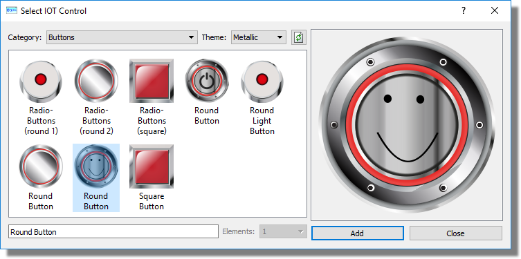
Any changes/new icons saved in the installation folders provided with Proteus will be overwritten and updated with new releases of Proteus. Custom folders will remain intact.