TEMPLATES TUTORIAL
Overview
As a starting point for the Templates tutorial, we'll use a pre-supplied sample project. From the Proteus home page click on the Open Sample button, navigate to the Tutorials category and select the Style Tutorial sample.
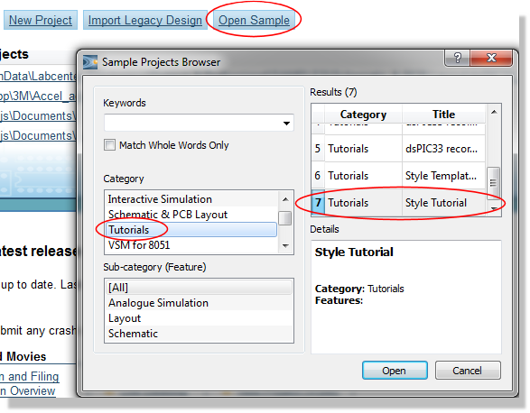
Opening the Style Tutorial sample from the Sample Projects Browser
When this loads, you will see that the basic colour scheme in this design is blue outlines with yellow fills for components and red for terminals, etc. and if you zoom in (roll the middle mouse button or use the zoom keys) about some text, you will see that it is all in the Labcenter Electronics vector font.
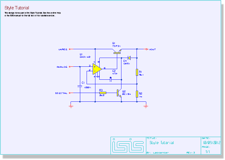
The Tutorial Circuit
The style system itself is described in Graphics and Text Styles; this tutorial is a worked example of using it.
Editing Global Styles
We will begin by looking at how to edit the global graphics styles. These styles are, as their name implies, global to the design and editing these styles allows you to make global changes to the appearance of a schematic. Further, when we then save the schematic as a design template these styles will then propagate to all designs started from the template.
Let us start by changing the component colour scheme a little. All the components in the design were picked from the standard libraries and as such, the component graphics are all drawn in the COMPONENT style. We can change this style using the Set Graphic Styles command on the Template menu. Select this command and you will see the Edit Global Graphics Styles dialogue form displayed as shown below.
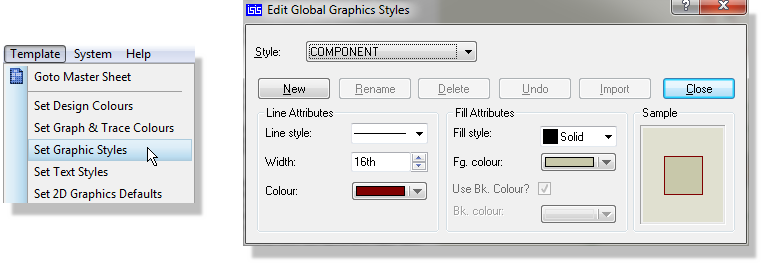
The Edit Global Graphics Styles dialogue form with the COMPONENT style selected
This form gives access to all the graphics styles defined for the current design; drop the Style selector down to see the full list. The buttons below it are New, Rename, Delete, Undo, Import and Close. New creates a style, taking its initial settings from the controls as they stand, so it doubles as a copy operation. Import brings in a style definition from another design or template file. The predefined styles cannot be renamed or deleted, so those two buttons are disabled while one of them is selected. There is no Edit button because editing happens in place: change the controls and the style changes with them.
Make sure the COMPONENT style is selected in the Style list. You will see in the Line Attributes and Fill Attributes sections the attributes for the style. Under Line Attributes select a red colour and then under Fill Attributes select a Fill style of none. After both changes you will see that the sample at the right of the dialogue form updates to show a new preview of the style as shown below.
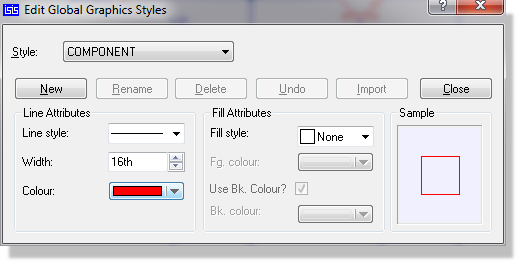
The COMPONENT graphics style edited to a red line colour with no fill
Now select the TERMINAL style in the Style list. The changes you made to the COMPONENT style are automatically saved and the dialogue changes to display the settings of the TERMINAL style. This time, under Line Attributes select a blue colour for lines and then under Fill Attributes select a Fill style of solid, which enables the Fg. colour control where you can select a yellow fill colour.
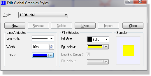
The TERMINAL graphics style with a blue line colour and a solid yellow fill
Close the form using the Close button and the schematic is redrawn to show the changes. The new colour scheme would probably work better on a white background and as you will probably print your designs on white paper, let's now select white as our paper colour. From the Template menu select the Set Design Defaults command. The Edit Design Defaults dialogue form allows you to edit most of the standard colours used by the schematic module including the background or paper colour. Change this to a light grey or white as shown below and close the form.
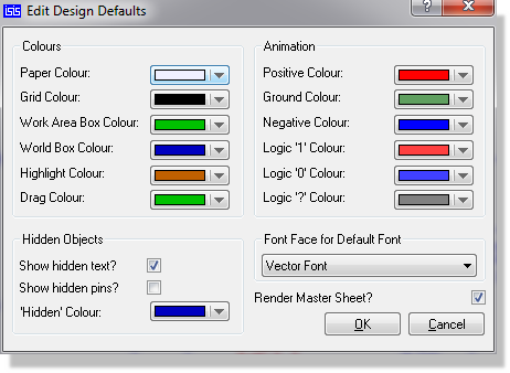
The Edit Design Defaults dialogue form with the paper colour changed
So we've seen how to change graphics styles. How about text styles? Changing these is pretty much the same as changing graphics styles except that the style attributes you get to change are different.
However, before we start changing the text styles of individual elements, let's change the text font used in the drawing en masse. As you've already noted, the drawing is currently displaying all its text in the Labcenter Electronics vector font. To change the default design font, again select the Set Design Defaults command from the Template menu to display the Edit Design Defaults dialogue form. Under Font Face for Default Font you will see Vector Font selected; change this to the standard Windows Times New Roman font face and close the form. The design is redrawn and all text can now be seen to be in Times New Roman.
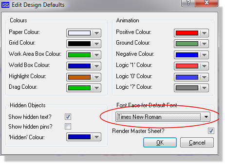
The Edit Design Defaults dialogue form with the default font face changed
Wherever Proteus offers a list of TrueType fonts (for example as part of editing a text style) there are always two additional font faces listed at the top of the list. These are Default Font and Vector Font. The Default Font option is a placeholder for whatever font is selected on the Edit Design Defaults dialogue form, whilst the Vector Font option selects the internal Labcenter Electronics vector font. In this sample project all the text and labels have been placed or edited to use the Default Font face, which means that it all displays in the font set on the Edit Design Defaults form. Select a new font face there and all the text in the design changes immediately.
The main use of the Vector Font is where you need to produce hard copy output on a pen plotter. Windows does not properly support the use of TrueType fonts on plotters, and the Labcenter Plotter Driver will output all text in the Vector Font whatever it is defined as on the drawing. The Vector Font has the additional advantage that it is guaranteed to come out exactly the same size on all hard copy devices as it does on the screen. This is not always the case with TrueType fonts.
On the other hand, if you only need to use bitmap devices such as printers these issues do not arise and you can use all your TrueType fonts as you see fit. It has to be said that schematics which use more than two font faces are likely to look very odd.
Having changed our design's default font to be Times New Roman, let's make some object specific text style changes. From the Template menu, select the Set Text Styles command to display the Edit Global Text Styles dialogue form. Notice how similar this dialogue form is to the Edit Global Graphics Styles dialogue form you saw earlier; as we said, editing text styles is very similar to editing graphics styles.
By default, COMPONENT ID should be the Style selected for editing and you will see that the Font face is set to Default Font which is, as we explained, the placeholder for the font selected on the Edit Design Defaults dialogue form, currently Times New Roman. Because of this, some fields on the dialogue form that aren't appropriate to a TrueType font, such as character width, are greyed out. Change the Font face to be Courier New and select Bold? under the Effects options.
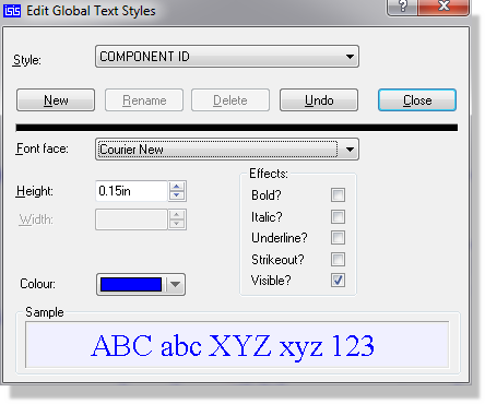
The COMPONENT ID text style set to Courier New with the Bold effect selected
Now select the PIN NUMBER style in the Style list (the changes to the COMPONENT ID style are automatically saved) and then uncheck the Visible? checkbox under the Effects options. Use the Close button to close the dialogue form.
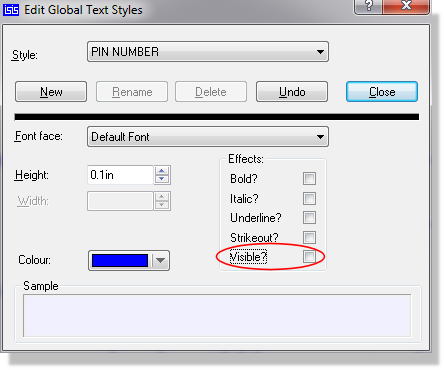
Clearing the Visible? effect on the PIN NUMBER text style
Editing Local Styles
So far we have only changed global styles. Changing these has had an effect right across the schematic. We will now look at making changes to local styles by editing the op-amp's U1 component reference label.
Note that changes to a local style are not propagated into the design template. They are intended for customising individual schematics only. If you want a style change to be permanent you should apply it as a global style change as detailed above.
Let's start by taking a look at a local style: click left on the U1 label to tag it (and the op-amp) and then click right and choose Edit Label from the menu. The Edit Part Id dialogue form is displayed.
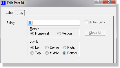
The Edit Part Id dialogue form
Now select the Style tab to see the local style settings. You will see the following: a Global Style selector at the top, a set of style attributes (Font face, Width, etc.) to the left and for each attribute a Follow Global? checkbox to the right. Both text and graphics local styles have this format. Wherever a Follow Global? checkbox is checked, the associated style attribute is taken from the global style named in the Global Style selector. Unchecking the Follow Global? checkbox enables the dialogue control for the associated style attribute, allowing you to specify a local value for that attribute. Not all the Follow Global? checkboxes are enabled: in this case the Width attribute is meaningless for a TrueType font face.
The change we are going to make is to make the U1 label a different colour. Start by unchecking the Follow Global? checkbox to the right of the Colour control and you will see the Colour control is enabled and displaying the current colour set in whatever global style this local style is following, in this case the COMPONENT ID style. Change the colour to be dark blue, then close the form and untag the op-amp so that it is redrawn in its normal colours. The U1 label is now dark blue.
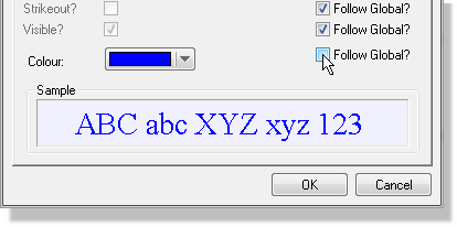
The Style tab with Follow Global? cleared for the Colour attribute
To verify that the label's colour is indeed now independent of the global style but that the remainder of the attributes are still following its global style, select the Set Text Styles command on the Template menu again, change the colour of the COMPONENT ID style (selected by default) to magenta, check the Italic? option and then close the form. The op-amp's component label remains dark blue, as its colour is no longer following the global COMPONENT ID style; its Italic attribute is still following the global style, so it is now italicised. All the other components' IDs, which have remained following the global COMPONENT ID style, have both changed colour and become italicised.
For completeness, we will now show you how to edit a local graphics style. Select 2D Graphics Box Mode. Now make sure the COMPONENT style is selected and then, placing the mouse at the top left of the circuit, click left and drag out a box that surrounds (and covers) the circuit diagram. We now need to change the local style of the box to be transparent. Choose Selection Mode and click left on the outline of the box to highlight it, then click right on the outline and select Edit Properties from the menu. The Edit Graphic Style dialogue form is displayed. Apart from the different style attributes, notice how this form is similar to the Style tab of the Edit Part Id dialogue form you have just used, and it works in the same way. Uncheck the Follow Global? checkbox for the Fill style control and then, it now being enabled, change the fill style to none. Under Line Attributes, uncheck the Follow Global? checkbox beside the Colour control and choose a colour of your choice (we have chosen blue). Close the form with the This Graphic Only button and untag the box.
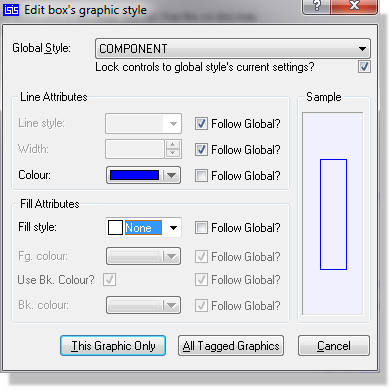
The Edit Graphic Style dialogue form for the box
The form's other button, All Tagged Graphics, applies the same local style to every tagged graphic rather than to the one you opened. It is the quickest way to restyle a whole block of drawing in one go.
This is a simple example of the power of local and global styles, though in general use you will rarely need to modify a local style. The main use of local styles is with 2D graphics objects such as lines and boxes when creating a new library part, and even then it is recommended that you avoid setting up local styles unless absolutely necessary. As you have seen, once an object has a local setting its appearance is fixed unless it is re-edited and, when applied to new library parts, this means that some or all of a library part will not blend in to the drawing in which it is used. In proper use, this is usually the intention: for example, that the base of a transistor always have a solid fill regardless of the fill selected in the global COMPONENT graphics style. However, when misused, it can lead to library parts that simply don't port between different colour schemes or users.
Editing the Master Sheet
Having now covered configuration of graphics styles we need to look at design configuration. The first thing we need to do is navigate to the master sheet with the Goto Master Sheet command on the Template menu, as shown below.
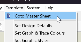
The Goto Master Sheet command on the Template menu
Think of the master sheet as a way to initialise the contents of all sheets with specific graphics. The contents of the master sheet are drawn on every sheet in the design, but are only editable when the master sheet is selected. This concept allows us, for example, to set up a header block and configure the sheet outline and size for all the sheets on the design in a single place.
The master sheet is for 2D graphics, imported images and scripts. The software does not prevent you placing components on it, but you must not do so: components on the master sheet are not part of the design's netlisted circuitry, and connectivity will break.
Two commands are unavailable while you are on the master sheet, Edit Sheet Properties and Remove/Delete Sheet, and automatic annotation is suppressed there. If you find those two commands greyed out on the Design menu, that is why.
More information on the Master Sheet can be found here.
You should see all the graphical objects on the design without any of the components, wiring etc. as shown below.
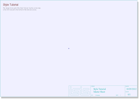
The master sheet of the tutorial design
Any changes you make to the graphics on this sheet will appear on all the sheets of the schematic. Further, they will be saved into the design template and will therefore appear in all designs started from the template. This means that you can set up your sheet size, header information, company logo etc. on a master sheet, save the schematic as a design template, and then reuse the template in all your future designs.
We will now use the master sheet to change the appearance of the design. Start by selecting the Set Sheet Sizes command from the System menu and changing the sheet size to be A3. The standard sizes are A4 at 10 by 7 inches, A3 at 15 by 10 inches, A2 at 21 by 15 inches, A1 at 32 by 21 inches and A0 at 44 by 32 inches, with a User entry you can set to whatever you need.
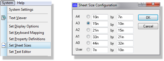
The Sheet Size Configuration dialogue form with A3 selected
Because you are on the master sheet you will be asked at this point whether you want to force all the other sheets in the design to the same size. Since we are enlarging the sheet, answer Yes.
If you make the sheet size smaller and you are working on a schematic you could end up with parts on an existing sheet outside of the work area. Caution is therefore required when adjusting the sheet size on the master sheet during design development.
One consequence of enlarging the sheet is that the sheet border drawn on the master sheet is now the wrong size for it. The border is an ordinary 2D graphics box, so to enlarge it simply click right on the box graphic and drag its handles until the box is aligned with the edges of the sheet. This resizes the border graphic; it does not change the size of the sheet, which you have already set on the Sheet Size Configuration form.
Now drag a box around the header block and move the block back into position at the bottom of the sheet as shown below.
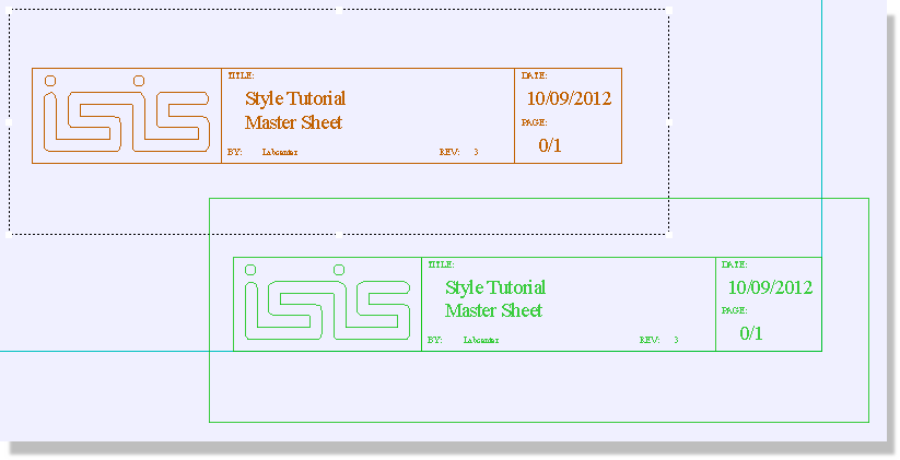
Moving the tagged header block into position
More information on customising the header block can be found here.
Finally, do the same with the script block, moving the text and graphics to an appropriate place on the sheet. You can of course change the text, font and colour of the script as detailed in the styles section above.
A common enhancement to the master sheet is the inclusion of a company logo. You can import a logo in PNG, GIF, JPG or BMP format with the Import Image command on the File menu.
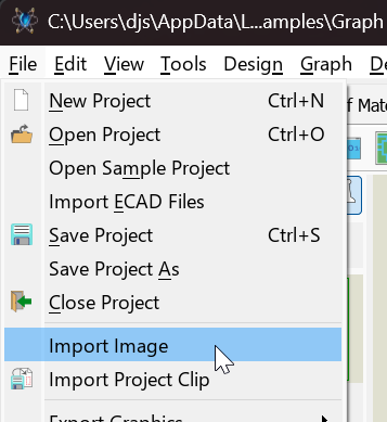
The Import Image command on the File menu
An imported image is stored without its transparency, so a PNG logo with an alpha channel is flattened to an opaque rectangle when it is brought in. If your logo needs to sit over the paper colour without a visible box around it, give it a background that matches the paper rather than relying on transparency.
As with the other elements of the master sheet you will want to position the logo carefully to avoid clashing with the actual electronic design on normal schematic sheets.
We will now go back to the root sheet of the design proper. To do this, select the sheet from the list at the foot of the Design menu, as shown below.
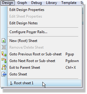
Returning to the root sheet from the Design menu
You can also navigate between sheets from the Design Explorer; see Design Explorer for details.
You can provide names for sheets on the schematic via the Edit Sheet Properties command on the Design menu. Naming a sheet makes it recognisable and easy to navigate to from the Goto Sheet command, particularly for hierarchical schematics.
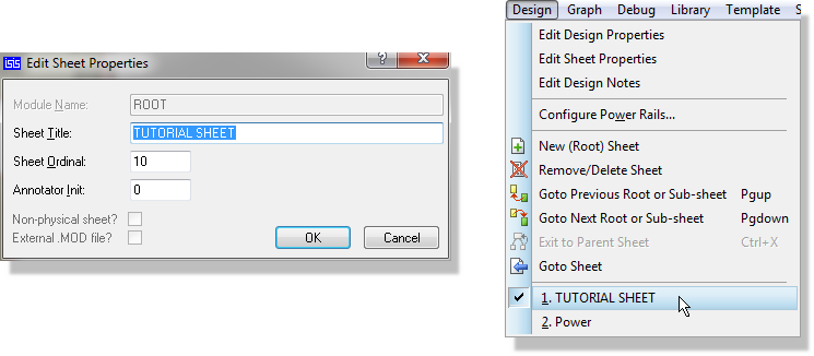
Naming a sheet with the Edit Sheet Properties command
Sheet properties and multi-sheet navigation are covered in Flat Designs.
You should now see that all the changes made on the master sheet are visible on the root sheet of the schematic, and that the components and wiring form but a small area of the sheet. Obviously this is a little contrived and for a real design of this size you would almost certainly stay with an A4 template, but it should give you some appreciation of the customisation options available to you.
Saving the Design Template
Having now covered both graphical and design customisation, all that remains is to make our schematic into a design template. To do this select Save Design as Template on the Template menu and name the template file appropriately, for example as tutorial.
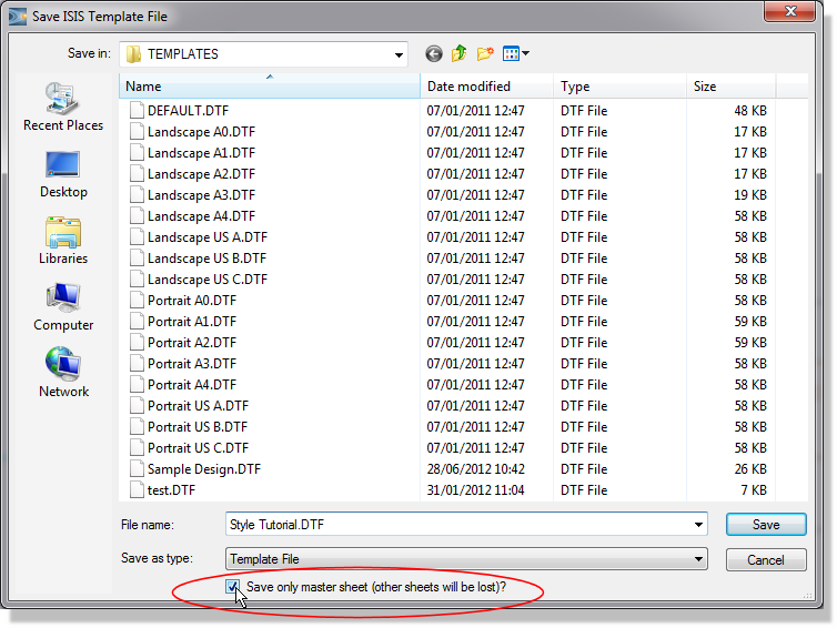
Naming the template file
Save Design as Template writes the master sheet and nothing else of your drawing, so the components and wiring are not saved in the template. That is what you want here, and it is the right behaviour generally: had the circuitry been saved, any part of it that later changed in the libraries would not be updated in designs started from the template.
Design templates must be saved in a folder named in the Template folders field of the System Settings command on the System menu. The field takes more than one folder, so you can keep company templates and personal templates apart.
When you start Proteus, or start a project directly from the schematic module, the default template is loaded. As shipped this is our own house style, but you can make it your own by saving your template under the name default.
The inverse command, Apply Styles From Template, takes the styles and appearance settings out of a template and applies them to a design you already have open. It does not bring the master sheet across, so it is the command to use when you want an existing design restyled rather than re-bordered.
Using a Design Template in a Project
The final thing we want to do is start a new project based on our template to ensure that all our changes have taken effect.
To use a design template in a project
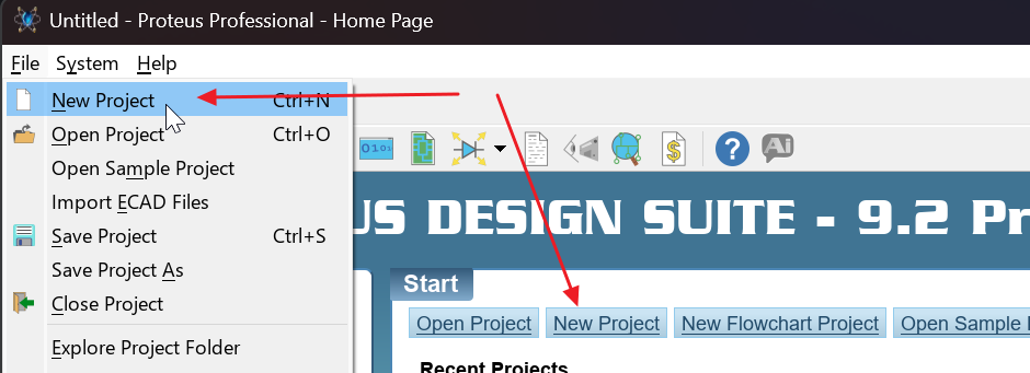
- Select New Project from the File menu or from the Proteus home page.
- Work through the wizard to the Create New Design page. Select Create a schematic from the selected template, which enables the Design Templates list, and choose the template you wish to use. The list holds the template files found in the folders named in the Template folders field of the System Settings command. When the project opens you should find that all of your styles are in use and that the master sheet is configured as specified in this tutorial.
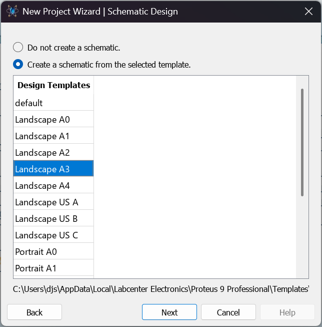
Choosing a design template on the Create New Design page
See Also: